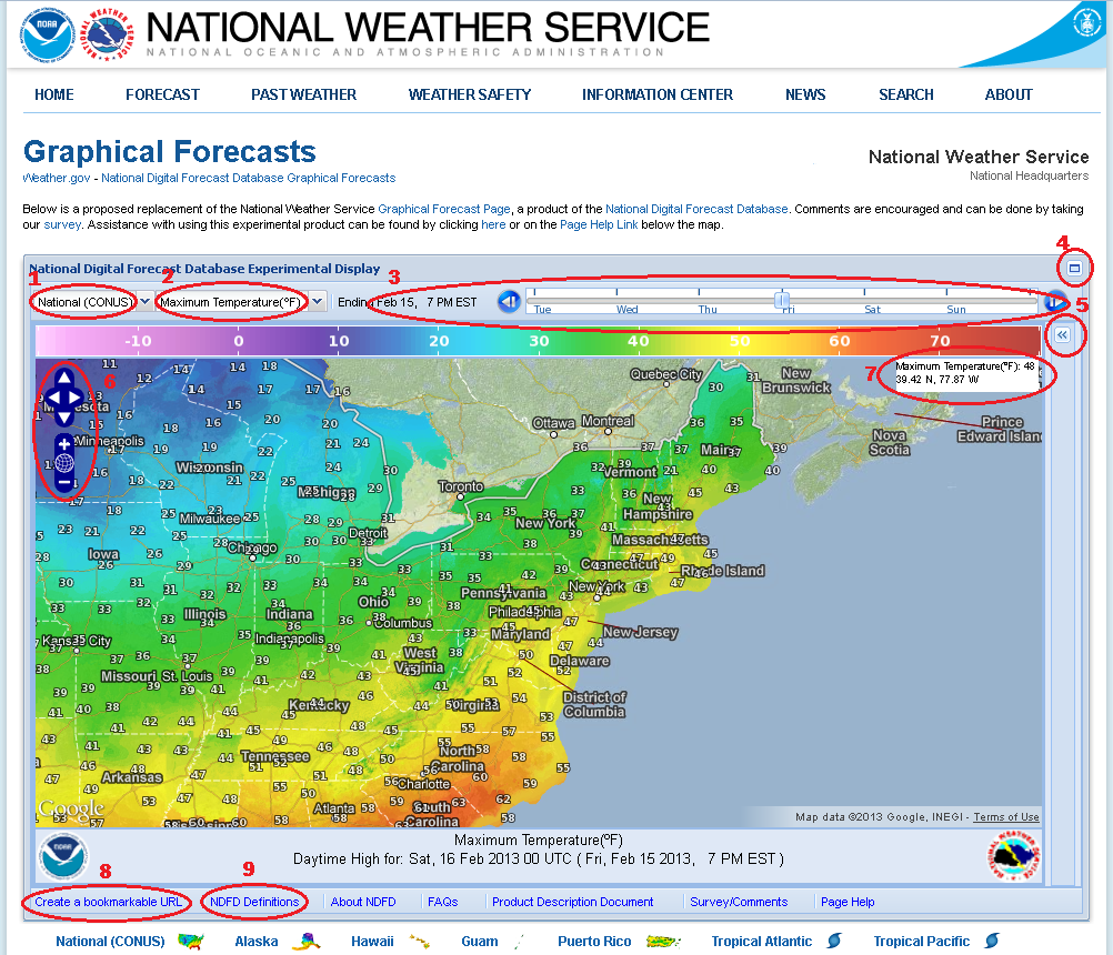
Thank you for exploring the National Weather Service National Digital Forecast Database (NDFD) Graphical Forecasts. Some of the controls and features of this map are circled/numbered on the image below with details following.

1 Geographic Region Selection /
2 Forecast Element Selection
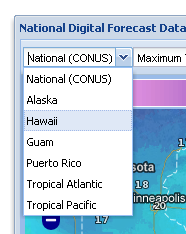
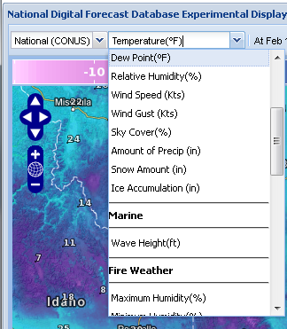
This first pull down menu allows you to select the desired region to view NDFD data for. The forecast element pull down menu provides a list of available NDFD data to view on the map.
3 Data Selection and Time Line
For each Region and Element selected, the date of the data is plotted on a timeline and in the Time Zone of the computer accessing the page. Click and drag the slider (circled below) left or right to change the valid time of the data displayed on the map. Also, selected data can be advanced one valid time by pressing the forward button to the right of the slider or the back button to the left of the slider. The large tick marks on the timeline indicate midnight and a valid data time while the smaller tick marks are plotted to show data valid times within each day. In the example below, Conterminous (lower 48) United States Weather is selected. The slider is positioned at data valid at 3am on December 7. The data valid times, as indicated by the tick marks, start as hourly for this element for Thursday and Friday, then are every 3 hours for Saturday and 6-hourly Sunday-Wednesday.
 4 Maximize Map Button
Pressing this button expands the map to fill your entire screen. The display can be returned to normal size by pressing the button in the upper right of the display.
5 Map Layers and Overlays Menu Button
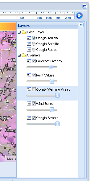
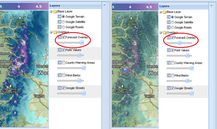
Clicking on the button slides the Layers/Overlay menu out. The menu will slide away when you click on the button again. Various Base layers can be selected; these are the map backgrounds used for the mapping display. The "Overlay" is the data layer, by checking the box adjacent to Forecast Overlay, the NDFD data is displayed on the map. Point Values can be placed on the map for select cities/locations by checking the box. County Warning Areas, the boundary of National Weather Service Forecast Offices, can be placed on the map as well. Wind information, shown as Wind Barbs allow for visualization of this data.
Below each of the Overlay options (Forecast Overlay, Point Values, County Warning Areas, Wind Barbs, and Google Streets), a slider allows the corresponding overlay to be more or less transparent. Moving the slider button left and right changes the opacity in a range from 0% (transparent) to 100% (opaque).

This can be useful, for instance, when looking at forecast elements, such as snow amount and comparing it to terrain. In the example below, the forecast overlay of snow amount is changed from nearly opaque to more transparent, revealing the mountain details from the map.
 6 Zoom/Pan Controls
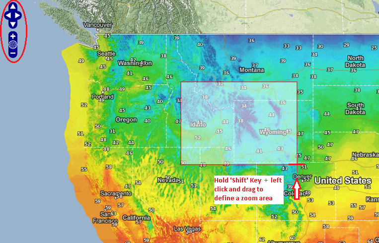
In the upper left of the map display, there are arrows that allow the user to move North, South, East, or West by clicking on the arrow pointing in the corresponding direction. Below that, the "+" and "-" buttons provide a way to zoom in and out on the map. The globe button between the +/- returns to the full regional view (zoom out).
To obtain a more custom map view, press and hold the .SHIFT. key on your keyboard while using the left mouse button to click and drag across the map. This highlights a box that adjusts as you move your mouse. When you are satisfied with the area selected, release the mouse and the map will show the region you selected.
Additionally, the zoom of the map can be controlled using the mouse scroll wheel, or zooming in can be achieved by double clicking on the map where you wish to be zoomed and centered.

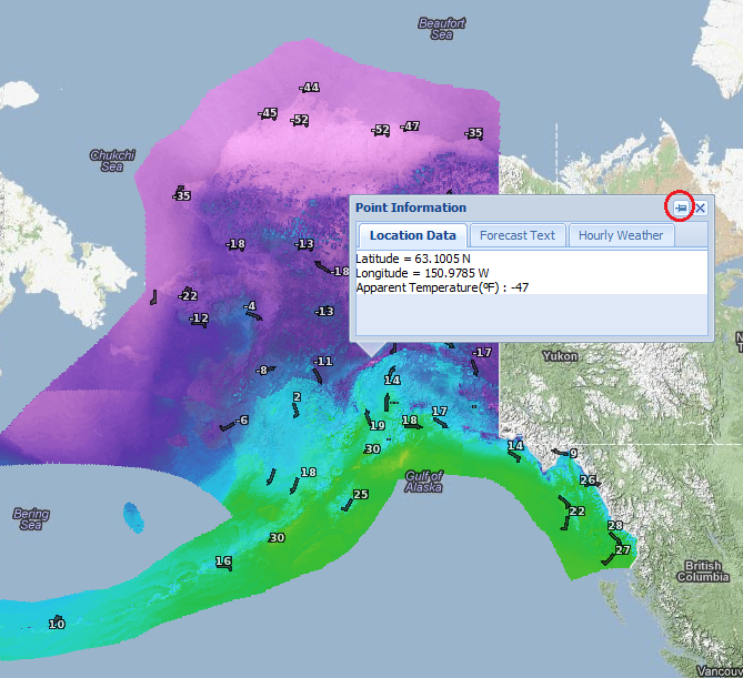
Single clicking on the map, as in the example below, pulls up a "Point Information" box, which displays location information for the clicked point as well as the forecast data value for the valid time selected. Advancing the time on the timeline updates the forecast values. By clicking on the 'pin' button (circled in the image below), you can then drag the information window anywhere on the page so that it does not obscure the view of the data.
 7 Current Data Display
In the upper right portion of the map, the location of the mouse curser on the map is display in degrees latitude/longitude as well as the forecast element name and forecast value at that point. This feature allows a quick view at the data without clicking on the map. (This feature requires newer web browsers: the forecast value will be absent if not supported by the browser)
8 Create Bookmark
Clicking on the "Create a Bookmarkable URL" button generates a web address that preserves the users preferred zoom and location as well as other map settings. Once this is clicked, the user can then set a bookmark in their web browser.
9 Forecast Element Definitions
A complete list of NDFD Forecast Element definitions can be found by clicking on this link, including a key displaying Hazardous Weather color codes and types, Weather types, and how to read/interpret Wind Barbs.
Keypad Shortcuts
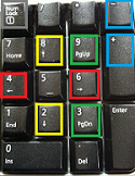
To assist with quickly adjust the forecast element, time step, and zoom, the following keypad shortcuts have been added. Please note: you must first activate "Num Lock" on your keyboard.
4 & 6 (left/right arrows): Shifts forecast time
8 & 2 (Up/Down arrows): Changes forecast element
9 & 3 (PgUp/PgDwn): Changes region
+ & - : Zooms in and out on the map
|

|
Keyboard Shortcuts
Use the left and right keyboard bracket keys (
[ or
] ) to see prior forecast issuances for the same forecast time.
[ or ] (left/right brackets): Moves to previous or next issuance
Shift + [ or ] : Moves to issuance time at least 6 hours earlier or later
Alt + [ or ] : Moves to issuance time at least 24 hours earlier or later
Shift + Alt + [ or ] : Moves to the earliest or latest available issuance
|
